Friday, February 19, 2016

When there just aren't words

About a month ago, a family in our neighborhood lost their two-year-old son. He had a tumor in and around his spine, and after the few months it took to find it, they lost him during treatment. The grief has filled our neighborhood, where we have seen too much loss (two families lost their newborns only hours after birth last summer), and many people have reached out to this poor family. Someone decorated the neighborhood with orange ribbons, a dozen women helped make small orange bows to pin on at the funeral, and many more have contributed meals and other meaningful offerings.


Please excuse the awful picture...I had the quilt for only 2 days between the binding and delivery, and we had horrible, dark weather both days...

Before he died, I began to plan a neighborhood quilt with a friend, but the boy died before most of us had started sewing. I was saddened that the quilt was now going to be a memorial quilt, but we pressed on and had almost 20 women help in some way on the quilt, whether it was donating money to help pay for the long arm quilting and backing, or contributing blocks, or offering help in laying out the final quilt.

I was overwhelmed by the number of people who offered to help, especially since many didn't know the family well. I think everyone really felt absolute sadness at the loss of a toddler. Whenever I think about it, I can't help but think of my own three-year-old and I just weep at what the mother must be going through. Did I mention she has a six-year-old and another on the way? Yep. Following his treatments, she couldn't even comfort him because the radiation could cause pregnancy complications.

Adorable quilted airplanes on a minky back.

Because I don't know her that well, and wanted to respect her space, I asked another friend who also helped with the quilt to deliver the quilt to her. I didn't get to see her reaction, but that's not really the point, is it? I truly hope that this quilt can offer comfort to them during this heartbreaking time. And it's been a huge reminder to me that quilts bring people together and can sometimes say things better than we ever could with words. Which is saying a lot, considering I was an English major. :-)

Friday, February 12, 2016

Fabric Selection Made Simple: Part 4

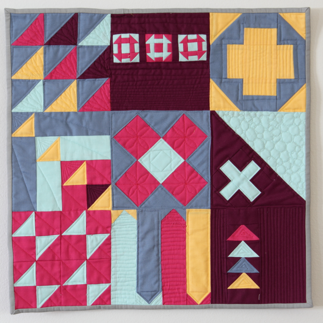
Here's the last post in my Fabric Selection Made Simple Series! I can't believe it's time to be over, the time flew. More than anything, I hope this has been helpful to you. I know there's lots of other blog posts about this, and chapters in quilting books, but I think everyone does it a little differently and hopefully my methods help you think about it in a way you haven't before.


Adding in fabrics: I typically collect basics when I add to my stash--that is, fabrics with one or two colors plus white, simple geometric patterns, prints that should go with a number of different lines. Sometimes, I just can't help myself and buy something adorable, but for the most part, I stick to basics. That doesn't mean my stash is full of polka dots--quite the contrary. But, if a print has a unique design and it's just one or two colors, I'm probably going to buy it. Here are some things to consider when you select fabrics for your quilt.
  • Solids vs. prints. A big consideration, especially today, is prints vs. solids. Prints are gorgeous, and for many of us, are inspiring and are even sometimes the motivation for quilting at all. But solids are pretty in-style right now and they definitely have an advantage sometimes. Even if you don't choose to use colored solids as a part of the design, you still have the option of selecting low volume prints as a background. Lots of choices...I tend to think that low volume can add a busyness to a design, and if your overall layout is very busy, you would be better served with using some solids. Your eyes really need a place to rest in a quilt and if there are too many different patterns of fabrics in a very complicated design, you lose that. But it can also bring interest to an otherwise boring place of the design. Pros and cons.

  • Scale/print subject. Scale in an important part of prints, as is subject matter. This is one reason I  love good solids; they are easier to work with. If the scale is too large, you'll need to take care in selecting a pattern that will have large enough pieces to let the beautiful images shine. I tend to go with a lot of very average scaled prints, although some variety in scale can add interest. This photo has prints that range in scale from small on the left to pretty large on the right. I love this building print, but I'm going to have to use it in blocks that have large pieces so you can tell what it is.

And regarding the subject...I know we've all seen really cute modern novelty prints, but with these you need to be careful. Personally, I would not pair girly butterflies with robots, or cowboy boots with dinosaurs, even if the color is right. Novelty prints are fun, but they require basics to go with them if they aren't from one integrated line. Some are generic enough to work (suns, stars, etc), but for the most part, you'll want to be careful.


Note that florals are such a widespread "genre" that they don't really count as novelty, but you probably wouldn't pair traditional florals (think French General) with super modern florals (think Lotta Jansdotter and Joel Dewberry).

These four florals are all what I would consider contemporary florals. They aren't too traditional, but they aren't super modern either. And if the colors worked together, I wouldn't hesitate to put them in the same quilt.


  • Style. This one is related to that last note. Some fabrics are very traditional and some are very modern. Most are somewhere in the middle. And maybe some people wouldn't worry so much about this, but I wouldn't choose to pair Cotton and Steel prints with 1930s reproductions, Civil War prints, or French General. Most likely, all the other considerations you've already made would prevent this anyway--Cotton and Steel doesn't use the same colors, undertones, or saturation levels as these other styles. But, in case you've already gone through all the other considerations and still feel like something is off, check on the style of your choices. This applies to novelty prints, as well. In the novelty print photo above, you'll notice the kitchenware print is very graphic and modern with crisp lines while the airplane print is more cartoony and juvenile, the gray building print is sketchy with uneven lines and the Bonnie and Camille umbrella print is a little more traditional (take a look at the bows, shading, and flourishes). Every artist has a style, and it's okay to mix them as long as you're aware and you don't go with too much contrast.

These are more traditional florals, especially the one on the left. The one on the right is by Cluck Cluck Sew (who designed the navy floral in the photo above) but if you'll notice, the flowers have a really similar shape to the flowers in the one on the left. The gray one looks like it could appear in a reproduction line without looking terribly out of place, which is good hint that it might be more traditional.


These two are very modern and graphic and need more care when pairing with other florals. They would look awful with the two traditional prints above.


  • Color Variations. Because fabric lines are so matchy-matchy, I think it's a common misconception that all the blues, for example, have to be a perfect match. I used to think this way, to be honest.  But, I've learned that it's more important that they are of similar saturation and undertone than to be an exact match, which is a huge relief because finding the exact same colors is pretty much impossible. And, if you're doing a scrappy project, it's actually better for there to be variation so that there is some contrast between the colors. I'm currently working on a project that really needs that variation because all the pinks are sewn directly together. If they all were a perfect match, the piecing would not be as visible. And if the piecing isn't visible, why bother?

  • Prints with extra colors. Not sure what to label this; but if you don't have a focal print and instead are using a variety of basics or near basics, you can take a cue from some of those prints if you need some ideas for adding different colors into your mix. For example, this Cotton and Steel has flowers in white, lilac, and orange. If I was putting together a bundle of navy, white, and lilac, and felt it needed a little something, I could pull in a pop of orange and because it's here in this print, it wouldn't feel out of place.

A lot of prints are like this, including a lot of the prints I've already used in this series. It's a great place to turn if you're stuck.

Again, thanks for playing along with me on this mini series and I hope you've learned something and can avoid (if you want) resorting to prepackaged fat quarter bundles. They're beautiful, but a quilt will be far more special and more "you" if you take the time to select all the fabrics you'll be using. Good luck, and feel free to ask questions if you have any!

Wednesday, February 10, 2016

It's a Small World Mini

I'm relatively new to the whole mini quilt bandwagon, but I am addicted! I think they're awesome for so many reasons: they're pretty quick and can be finished in a couple days if you're under pressure, but a few weeks at the most, they require very little fabric investment, they don't add to the ever accumulating pile of throw and bed quilts in the house, they don't require a longarmer...and that's just the practical stuff. I also love that I can try out free motion quilting without having to wrestle a huge quilt, and I love that they make great gifts that aren't overly extravagant. I also love that you can get pretty creative with the subject of the quilt, moreso than you can with throw quilts. I'm not one for cutesy and themed things in big quilts, but minis work.


So last year, when the hype around Jen Kingwell's My Small World quilt was circulating and everyone was DYING to get their hands on a copy of the French publication the pattern appeared in, I wanted to get one too. As photos of different versions floated around Instagram, I realized it would make a perfect gift for my friend, Julie. We've been to Disneyland with Julie twice; both times we had our oldest daughter, and the second time Julie had her 4 girls with us. It was so fun, and I know It's a Small World is one of Julie's very favorite rides. I immediately started scheming, but felt the Jen Kingwell version was a little abstract for my purpose. I started brainstorming...and found Leasa's pattern that she designed after the one she made for her Disney Quilt swap partner. I almost bought it, but realized her pattern made a pretty big quilt--I think it's almost 48 inches in one direction. Yikes! So, I started sketching from photos and images I found online...and then when I got EQ7 for Christmas, it was one of the first things I designed in the program. It was actually a little clunky, but I'm still learning how to use EQ7, and eventually I got what I needed (a bunch of paper piecing templates).

I did mess up on the math for some of the cutting, but since I'd taken the care to design it on a very easy grid, it was easy to fix. And I messed up on the paper piecing pieces for the tops--I'd totally spaced the fact that since they were "turrets" and roof pieces, I should be using the "sky" fabric for the background...so I got to redo every single one. *sigh* But it worked out fine and didn't add too much extra work.


I stitched the face on in gold embroidery floss (I used DMC brand). It was awful to work with, but I think it turned out fine. I thought the gold was just perfect. I would have been willing to redo it in gray or something, but, I really wanted the gold to work.


When it came to quilting, I felt rushed because I had only about 5 days before her birthday and I was at a complete loss for ideas. I considered pebbling the sky, but what to do with the main part? In the end, I did a simple cross-hatching. I didn't want anything to distract from all the fun fabrics or the embroidered face.

I hope she loves it, I had a fun time planning it for her and thinking about her while I schemed. I love a good mini quilt for a birthday gift!

Friday, February 5, 2016

Fabric Selection Made Simple: Part 3

This is an update on what I mentioned last time on undertones. Preeti of Rambling Roses asked a question about using fabrics of the same color with different undertones in a single color quilt. I wrote her back, and my email got a little long-winded, but I realized that the way she had phrased her question helped me realize I hadn't clarified things thoroughly and it gave me a different way to think about it.

I referred her to my blog post about my churn dash mini quilt.


I used a variety of blues, but they're pretty similar in undertones. The only exception is the Cotton and Steel "Dottie" print in the corner which is warmer and has just a hint of yellow. I went ahead and used it because the dots are white. Here are a few of the navy blues I used, along with a couple new ones, and if you look closely, you'll see they're all a little different. The herringbone on top is the darkest and is almost black, while the Michael Miller Stitch Squares is almost a little purple. But they're all really within the same range and use the same undertones, and I think they work well. A little variation is interesting.


The white in the design is a great hint at the undertone. If a print has white in the design (as opposed to cream or ivory), it will most likely have a  "clean" undertone. I personally wouldn't put prints that used cream with prints that use stark white. But that doesn't mean cream is bad, of course. It all depends on what you're after.

These two pinks have different undertones and I know it's very, very subtle. I picked these ones on purpose. The pink is almost identical, really. But the Cluck Cluck Sew floral on the bottom has a white design while the dots one on top has ivory in it. I bought it to use with my daughters' quilts, not realizing at the store that it wasn't white, but in the end, I couldn't because the undertone was wrong. It looks a little dirtier next to prints that have a nice, clean white undertone.


This isn't a hard and fast rule--if you like something, you should go for it!

Sunday, January 31, 2016

Mini Mania Challenge: Sampler Time!

For the Mini Mania Challenge group on Flickr, we combined December and January for a super challenge (and a break for the holidays...): a sampler! I loved this challenge because there were so many directions to go, and so many online resources right now. With the Moda Block Shuffle and the Janome modern block 100 blocks in 50 days thing, there were a lot of options to pick from that didn't need resizing. Wahoo! Resizing is not my thing...I also got EQ7 for Christmas, so between those and EQ7, I knew I'd be able to do something fun.


Picking fabric stumped me, though. Despite by scraps organization, I was flummoxed, and decided, instead, to stick with a few solids from my stash. I think this was largely inspired by the Janome blocks, which were done in conjunction with Michael Miller solids. They were so bold and graphic, I just loved them. So, I brought out a few of my favorite solids and got to work!

At first, I thought it'd be cool to stick with a theme--like, all plus/x block styles, or all churn dash variants, or something...but in the end, the blocks I wanted to make weren't all the same type, so there's a few themes. Which means there's no theme, really.


When it came time to quilt it, I tried to figure out a color for doing an all-over pattern, but, really, this demanded switching colors. So that took a while, but I think it was worth it. And I quilted it a ton. Which I like to look at even if I don't like to snuggle under it, so it's perfect for a wall quilt. :-) I really like what I thought of for this block, and I'm pleased it mostly turned out!


I don't always like how samplers look to be honest...they can often feel disjointed, which is why I wanted to stick with a theme. But I enjoy making them. Selecting fabric for each block is fun! And seeing each new block is like a surprise. And I do like the way this one turned out. I got Elizabeth Hartman's Patchwork City for Christmas, so I think more samplers are in my future!

Friday, January 22, 2016

Fabric Selection Made Simple: Part 2

I'm back with the second post in my mini series on selecting fabric. I hope the last post got you thinking about color and inspiration. If you missed it, feel free to go and read it, I'll wait. This week, we'll go over some basic color theory to help fine tune your bundle. Once you have a basic idea of where you're going, you can start to finesse it and really make it yours. Here are some things to consider as you work with your color palette.


Whichever method to pick a palette you start with, you always have to start pulling fabric with one. There's always a first fabric. Sometimes, that matters, like if you're basing it around a focal fabric. Other times, it really doesn't matter. Once I've got one fabric, I have a good idea of the warmth and saturation I'm going for. I'm into photography, so I tend to think about it in terms of white balance. When you take a photo, the camera generally tries to guess how white (or not) the light is so that whites appear white in the photo. While it is not the same by any means, that's how I tend to think about fabrics that work together. So, there's a few things to consider. By the way, my formal training is in English literature, not science or art. So--if I've goofed on a label or something, just let me know (nicely, please!) in the comments. This is my understanding based on several art classes and my own personal experience. 
  • Saturation. It's good to have some variation in saturation levels to provide contrast, but I like to keep them within a close range. And there are still plenty of variations in saturation levels without getting too extreme! Most people would not find pastels to work well with dark, dark colors like burgundy or forest green. Part of that is saturation, but it's also the undertones, which I'll talk about in the next bullet point. Saturation is about how much color is in a color if that makes sense...think about it in terms of adding white paint to a primary color (to get those dark colors like burgundy and forest green, you need to add black to the primary colors). It produces a pastel, but it's a pastel because the color isn't as strong. You can find "light" colors that are saturated, but high saturation is most often associated with super brights and jewel tones. 


If you struggle with this concept, try taking a black and white photo of your fabrics. You'll be able to see which are lower in saturation. (I used a green filter on these pink fabrics which helped amplify the saturation differences--you may need to play around with it. Also, note the green filter was appropriate because the fabrics were pink--the complimentary color! :-))

  • Undertones. This is related to the white balance I mentioned earlier. If you compare two different prints that are in the same color range, you'll probably notice that one looks "cleaner" than the other, or more "pure." That has to do with the undertones of the color. A primary color will appear more pure, while others will be a bit off-white. Think of red and rust. The rust pairs well with cream or off-white while the red works better with white. Fabrics with different undertones can certainly work together, but they will be higher contrast and you need to be aware of mixing them. You probably wouldn't pair pastel cantaloupe orange with rust orange, and it has to do with the undertones. They just wouldn't "look right." Often, if you feel like something doesn't look right, it's due to the undertones.
A really good color to compare and understand this concept with is gray. If you pull five or six grays out, assuming they aren't by the same designer, you'll notice that some are more brown, some are more blue, some might even look a little purple, and some might look silver (but matte). They could all be the same saturation level, but will be different. This is due to the different undertones of the color (and undertones obviously don't have to be either pure white or cream).  These grays I found in my drawers are all about the same saturation level, but look vastly different. Okay, maybe vastly is an exaggeration, but you get my point.

  • Warm vs. cool colors. This is a little bit of color theory. All colors are categorized by being either warm or cool. If a color is blue, green, or purple, it is a cool color. If it's red, orange, or yellow, it's warm. More often than not, a quilt will contain both warm and cool colors, even if it's predominately one or the other. Using both helps provide both balance and contrast. There are exceptions, of course. However, if you feel like your bundle is missing something, try adding in a color from the opposite group. If you're mostly using warm colors, try adding in a pop of a cool color. If the contrast is too stark, try adding in a cool color that's on the warmer side, like a lime green, or a warm color that's a little cool, like magenta.

In the color wheel below, notice that the cool colors are all on the left side of the color wheel and the warm colors are on the right.

  • Complimentary colors. This goes hand in hand with warm and cool colors, but is a bit more specific. If you look at a color wheel, the complimentary colors are those that are directly across from each other. So, red and green are complimentary, orange and blue are a pair, and yellow and purple. Of course, this goes beyond the most basic crayon box shades as well. yellow-green is a compliment of magenta. Blue-violet is a compliment of yellow-orange. This is a great starting place for finding colors that work together if you're stumped. Even if you don't use the direct compliment, this can help you see what might work well together. Also, if you'll notice, complimentary color pairs include all three primary colors: A primary color is always directly opposite a secondary color of the two other primary colors (i.e.: red is a compliment of green, which is made of blue and yellow). I think that must be why they work so well together: they are balanced because all the colors are there. 

So--hopefully I haven't hurt your brain with this color theory. Stay tuned for next time, when I'll post about fabric selection and some important considerations there. In the meantime, challenge yourself to think hard about the colors you're including and why you like them together.

Wednesday, January 20, 2016

I {heart} quilts

I've wanted to make a Valentine's quilt for a while...I couldn't find the link, but I feel like I read about someone who had a Valentine's Day quilt and they passed it around the family. Someone would start with it, and they would do something kind for another family member and the quilt would pass onto them, and so on, and so on. What I really loved about this idea was that it encouraged everyone to show love for each other. I'm really not big on Valentine's Day...but this, I could get behind. I didn't love the quilt she had, but I did really like the heart quilt on Allison Harris's blog.


I pulled fabric out, and when I had my stack, I realized how much I thought my sister-in-law would like it, so I resolved to make two. Then, I realized that we would most likely visiting my sister-in-law and her family (who live in a different state) after Christmas, so all of the sudden, the pressure was on! I checked in with Abby Latimer, my go-to quilter, and had just about a week or so to get them in to her to get them back in time for Christmas...and I made it!

I quickly bound hers and took it with us when we did go down to visit. She loved it! I never actually got a picture of hers, but it's identical to mine, save the binding. I bound hers in navy blue. 

I really love this modern twist quilting that Abby did on it; I think I'll use it more often.


I tried out a new binding technique. I'm still feeling my way around binding. While I have improved tremendously, I'm still working on my skills and am trying to find my preferred method. This time, I glue basted (I've done this several times now), and finished it with a zig zag stitch. My hope was that this would be more forgiving...it sort of worked. :-) I still need to practice, of course. Especially since mine is a little wavy, even though I did my best to square the quilt before I bound it, so I'm not sure why it's wavy...oh well...it's handmade and not supposed to be "perfect," right?

I {heart} Quilt
completed January 2016
Tutorial by Allison Harris
Quilted by Abby Latimer