Sunday, January 31, 2016

Mini Mania Challenge: Sampler Time!

For the Mini Mania Challenge group on Flickr, we combined December and January for a super challenge (and a break for the holidays...): a sampler! I loved this challenge because there were so many directions to go, and so many online resources right now. With the Moda Block Shuffle and the Janome modern block 100 blocks in 50 days thing, there were a lot of options to pick from that didn't need resizing. Wahoo! Resizing is not my thing...I also got EQ7 for Christmas, so between those and EQ7, I knew I'd be able to do something fun.


Picking fabric stumped me, though. Despite by scraps organization, I was flummoxed, and decided, instead, to stick with a few solids from my stash. I think this was largely inspired by the Janome blocks, which were done in conjunction with Michael Miller solids. They were so bold and graphic, I just loved them. So, I brought out a few of my favorite solids and got to work!

At first, I thought it'd be cool to stick with a theme--like, all plus/x block styles, or all churn dash variants, or something...but in the end, the blocks I wanted to make weren't all the same type, so there's a few themes. Which means there's no theme, really.


When it came time to quilt it, I tried to figure out a color for doing an all-over pattern, but, really, this demanded switching colors. So that took a while, but I think it was worth it. And I quilted it a ton. Which I like to look at even if I don't like to snuggle under it, so it's perfect for a wall quilt. :-) I really like what I thought of for this block, and I'm pleased it mostly turned out!


I don't always like how samplers look to be honest...they can often feel disjointed, which is why I wanted to stick with a theme. But I enjoy making them. Selecting fabric for each block is fun! And seeing each new block is like a surprise. And I do like the way this one turned out. I got Elizabeth Hartman's Patchwork City for Christmas, so I think more samplers are in my future!

Friday, January 22, 2016

Fabric Selection Made Simple: Part 2

I'm back with the second post in my mini series on selecting fabric. I hope the last post got you thinking about color and inspiration. If you missed it, feel free to go and read it, I'll wait. This week, we'll go over some basic color theory to help fine tune your bundle. Once you have a basic idea of where you're going, you can start to finesse it and really make it yours. Here are some things to consider as you work with your color palette.


Whichever method to pick a palette you start with, you always have to start pulling fabric with one. There's always a first fabric. Sometimes, that matters, like if you're basing it around a focal fabric. Other times, it really doesn't matter. Once I've got one fabric, I have a good idea of the warmth and saturation I'm going for. I'm into photography, so I tend to think about it in terms of white balance. When you take a photo, the camera generally tries to guess how white (or not) the light is so that whites appear white in the photo. While it is not the same by any means, that's how I tend to think about fabrics that work together. So, there's a few things to consider. By the way, my formal training is in English literature, not science or art. So--if I've goofed on a label or something, just let me know (nicely, please!) in the comments. This is my understanding based on several art classes and my own personal experience. 
  • Saturation. It's good to have some variation in saturation levels to provide contrast, but I like to keep them within a close range. And there are still plenty of variations in saturation levels without getting too extreme! Most people would not find pastels to work well with dark, dark colors like burgundy or forest green. Part of that is saturation, but it's also the undertones, which I'll talk about in the next bullet point. Saturation is about how much color is in a color if that makes sense...think about it in terms of adding white paint to a primary color (to get those dark colors like burgundy and forest green, you need to add black to the primary colors). It produces a pastel, but it's a pastel because the color isn't as strong. You can find "light" colors that are saturated, but high saturation is most often associated with super brights and jewel tones. 


If you struggle with this concept, try taking a black and white photo of your fabrics. You'll be able to see which are lower in saturation. (I used a green filter on these pink fabrics which helped amplify the saturation differences--you may need to play around with it. Also, note the green filter was appropriate because the fabrics were pink--the complimentary color! :-))

  • Undertones. This is related to the white balance I mentioned earlier. If you compare two different prints that are in the same color range, you'll probably notice that one looks "cleaner" than the other, or more "pure." That has to do with the undertones of the color. A primary color will appear more pure, while others will be a bit off-white. Think of red and rust. The rust pairs well with cream or off-white while the red works better with white. Fabrics with different undertones can certainly work together, but they will be higher contrast and you need to be aware of mixing them. You probably wouldn't pair pastel cantaloupe orange with rust orange, and it has to do with the undertones. They just wouldn't "look right." Often, if you feel like something doesn't look right, it's due to the undertones.
A really good color to compare and understand this concept with is gray. If you pull five or six grays out, assuming they aren't by the same designer, you'll notice that some are more brown, some are more blue, some might even look a little purple, and some might look silver (but matte). They could all be the same saturation level, but will be different. This is due to the different undertones of the color (and undertones obviously don't have to be either pure white or cream).  These grays I found in my drawers are all about the same saturation level, but look vastly different. Okay, maybe vastly is an exaggeration, but you get my point.

  • Warm vs. cool colors. This is a little bit of color theory. All colors are categorized by being either warm or cool. If a color is blue, green, or purple, it is a cool color. If it's red, orange, or yellow, it's warm. More often than not, a quilt will contain both warm and cool colors, even if it's predominately one or the other. Using both helps provide both balance and contrast. There are exceptions, of course. However, if you feel like your bundle is missing something, try adding in a color from the opposite group. If you're mostly using warm colors, try adding in a pop of a cool color. If the contrast is too stark, try adding in a cool color that's on the warmer side, like a lime green, or a warm color that's a little cool, like magenta.

In the color wheel below, notice that the cool colors are all on the left side of the color wheel and the warm colors are on the right.

  • Complimentary colors. This goes hand in hand with warm and cool colors, but is a bit more specific. If you look at a color wheel, the complimentary colors are those that are directly across from each other. So, red and green are complimentary, orange and blue are a pair, and yellow and purple. Of course, this goes beyond the most basic crayon box shades as well. yellow-green is a compliment of magenta. Blue-violet is a compliment of yellow-orange. This is a great starting place for finding colors that work together if you're stumped. Even if you don't use the direct compliment, this can help you see what might work well together. Also, if you'll notice, complimentary color pairs include all three primary colors: A primary color is always directly opposite a secondary color of the two other primary colors (i.e.: red is a compliment of green, which is made of blue and yellow). I think that must be why they work so well together: they are balanced because all the colors are there. 

So--hopefully I haven't hurt your brain with this color theory. Stay tuned for next time, when I'll post about fabric selection and some important considerations there. In the meantime, challenge yourself to think hard about the colors you're including and why you like them together.

Wednesday, January 20, 2016

I {heart} quilts

I've wanted to make a Valentine's quilt for a while...I couldn't find the link, but I feel like I read about someone who had a Valentine's Day quilt and they passed it around the family. Someone would start with it, and they would do something kind for another family member and the quilt would pass onto them, and so on, and so on. What I really loved about this idea was that it encouraged everyone to show love for each other. I'm really not big on Valentine's Day...but this, I could get behind. I didn't love the quilt she had, but I did really like the heart quilt on Allison Harris's blog.


I pulled fabric out, and when I had my stack, I realized how much I thought my sister-in-law would like it, so I resolved to make two. Then, I realized that we would most likely visiting my sister-in-law and her family (who live in a different state) after Christmas, so all of the sudden, the pressure was on! I checked in with Abby Latimer, my go-to quilter, and had just about a week or so to get them in to her to get them back in time for Christmas...and I made it!

I quickly bound hers and took it with us when we did go down to visit. She loved it! I never actually got a picture of hers, but it's identical to mine, save the binding. I bound hers in navy blue. 

I really love this modern twist quilting that Abby did on it; I think I'll use it more often.


I tried out a new binding technique. I'm still feeling my way around binding. While I have improved tremendously, I'm still working on my skills and am trying to find my preferred method. This time, I glue basted (I've done this several times now), and finished it with a zig zag stitch. My hope was that this would be more forgiving...it sort of worked. :-) I still need to practice, of course. Especially since mine is a little wavy, even though I did my best to square the quilt before I bound it, so I'm not sure why it's wavy...oh well...it's handmade and not supposed to be "perfect," right?

I {heart} Quilt
completed January 2016
Tutorial by Allison Harris
Quilted by Abby Latimer

Friday, January 15, 2016

Fabric Selection Made Simple: Part 1

I really enjoy doing my Fabric Friday posts. I love going through my stash and I really love seeing how I can use a print in several very different fabric bundles to accomplish different feelings. I feel like I've always been pretty good at picking fabric and colors, but this weekly (or almost...) ritual has given me a lot of practice and I feel like I'm better at it now than I was. I also thought that, while it might be easy for me to do, it might be intimidating for others. I know I've heard people comment that it's easier to stick to a single line, or they wouldn't know how to use more than a single line. My own mother is intimidated by it, to be honest. So, I thought I'd share my process. I hope it's helpful to you! After I started writing this post, it got a little long for a single post, so I've made it into a series. Today, I'll be starting with color inspiration, and the next post will feature tips for fine tuning a color palette, and the last post will focus on some considerations for adding fabric to your palette.


Finding Color Inspiration: There are lots of ways to get started, and I've used all of the following methods at one time or another.
  • An inspiring photo. My autumn bundle was inspired by a series of photos, or, rather, by the current weather situation which reminded me of said photos. If you're looking for a specific feeling, this method can be helpful as the photo will have the same feeling.

  • A pre-existing color scheme. This one's especially easy for holidays, right? If you're going to make a Christmas quilt, it's easy to start with red and green.

None of these fabrics come from "Christmas" fabric lines, but all would be at home in a Christmas quilt. In fact, I've used the Cotton and Steel and the Reunion print in Christmas quilts, and they look great!


But, it can work in other ways. Pink and aqua are popular, blue and yellow are classic, and blue and gray are calming. You can start off with an idea of what you'd like by using classic pairings and then adding a contrasting color for a pop.

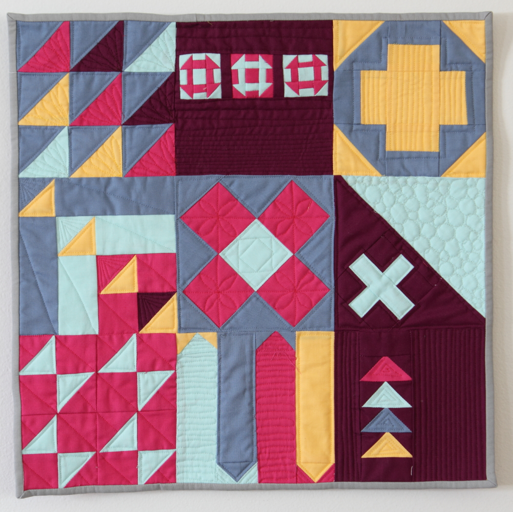
  • Another quilt. This doesn't mean you have to use the same pattern or fabric, but if there's a quilt you really admire for the colors, you can use that to inspire a color scheme for your own quilt. This bundle was inspired by a single block from a Saturday Sampler club I participated in several years ago. I altered it a little, but that's where my inspiration came from. And now, it's a current WIP.
  • Clothing or home decor. I'm totally into navy and aqua or mint right now. Like, kind of obsessed. And you know what? It all started when I bought my swimming suit a couple of years ago with diagonal navy and mint stripes. Home decor is usually pretty stylish and since your quilt will be located within a decorated space, it's a great place to start so that it will look at home.
  • A focal fabric. This one is where most people start when they are first exploring their own ideas. Pick a focal fabric and find coordinating colors. You don't have to use all, or only, colors from the print, but you certainly can if that's where you are comfortable. You also don't have to include the focal print in your bundle, it can be used just as a starting place if you'd like.
I really love this Paris print. If you've been around long enough, you'll know by now that Paris is my happy place. I buy attractive Paris prints whenever I can. I love the colors in this one, and I can't wait to use it. I pulled these to go with it.


But, pulling the focal fabric out works, too. They look great together.


Here are the fabrics I auditioned that didn't make the cut. The color wasn't quite close enough for me, or they didn't work with the other prints. Lots to consider, and there's no right answer--if you like it, you should use it!

  • Factor X. I'm not sure what to call this one, because this is where I just kind of pull fabrics. I start with one that I'd like to use, either to challenge myself because I don't know what to do with it, or because I'm finding it really pretty that day. And I pull fabrics to go with it. I'll talk more about that in the next section.
Stay tuned for the next post, where I'll share some more specific ways to fine tune the colors you pick. We'll get in to a little bit of color theory (but I'll keep it accessible!).

Friday, January 8, 2016

Fabric Friday: January 8

Happy New Year! I hope you had a great Christmas season; we sure did. We even got to visit some family after Christmas in Phoenix. It was colder than I expected, but we had a great time with our family. I haven't actually gotten around to setting New Year's Resolutions yet...and here we are, a whole week in, but I do have lots of plans. They just aren't very fleshed out... :-)


I'm afraid it's been longer than I intended since I've pulled a fabric bundle for the blog...but, here's one. Lot of the prints are new fat quarters I bought at a local shop's Fat Quarter Friday sale. I love those. For the end of the year/holiday season, they did a 7/$12 special, which I just couldn't pass up, and I bought 14. That makes it the equivalent of $6.86 a yard! Wahoo! I'm really digging these bright jewel tones right now. Pink. This year will be the year of pink for me I think. It's a good thing I have little girls.


And, for those of you who might be interested, I'm working on a blog mini series about how I select fabric for projects, I just need to take a few photos. So, stay tuned...that will be coming hopefully soon!

This week's bundle includes First Crush by Sweetwater, Mon Ami by BasicGrey, Noteworthy by Sweetwater, XOXO by Cotton and Steel, Simply Colorful 2 by V and Co, Stitch Square by Michael Miller, Paper Bandana by Cotton and Steel, Bright Heart by Amy Butler, Rhoda Ruth by Elizabeth Hartman, and Modern Mini's by Lori Holt.


Have a great weekend!