

Whichever method to pick a palette you start with, you always have to start pulling fabric with one. There's always a first fabric. Sometimes, that matters, like if you're basing it around a focal fabric. Other times, it really doesn't matter. Once I've got one fabric, I have a good idea of the warmth and saturation I'm going for. I'm into photography, so I tend to think about it in terms of white balance. When you take a photo, the camera generally tries to guess how white (or not) the light is so that whites appear white in the photo. While it is not the same by any means, that's how I tend to think about fabrics that work together. So, there's a few things to consider. By the way, my formal training is in English literature, not science or art. So--if I've goofed on a label or something, just let me know (nicely, please!) in the comments. This is my understanding based on several art classes and my own personal experience.
- Saturation. It's good to have some variation in saturation levels to provide contrast, but I like to keep them within a close range. And there are still plenty of variations in saturation levels without getting too extreme! Most people would not find pastels to work well with dark, dark colors like burgundy or forest green. Part of that is saturation, but it's also the undertones, which I'll talk about in the next bullet point. Saturation is about how much color is in a color if that makes sense...think about it in terms of adding white paint to a primary color (to get those dark colors like burgundy and forest green, you need to add black to the primary colors). It produces a pastel, but it's a pastel because the color isn't as strong. You can find "light" colors that are saturated, but high saturation is most often associated with super brights and jewel tones.

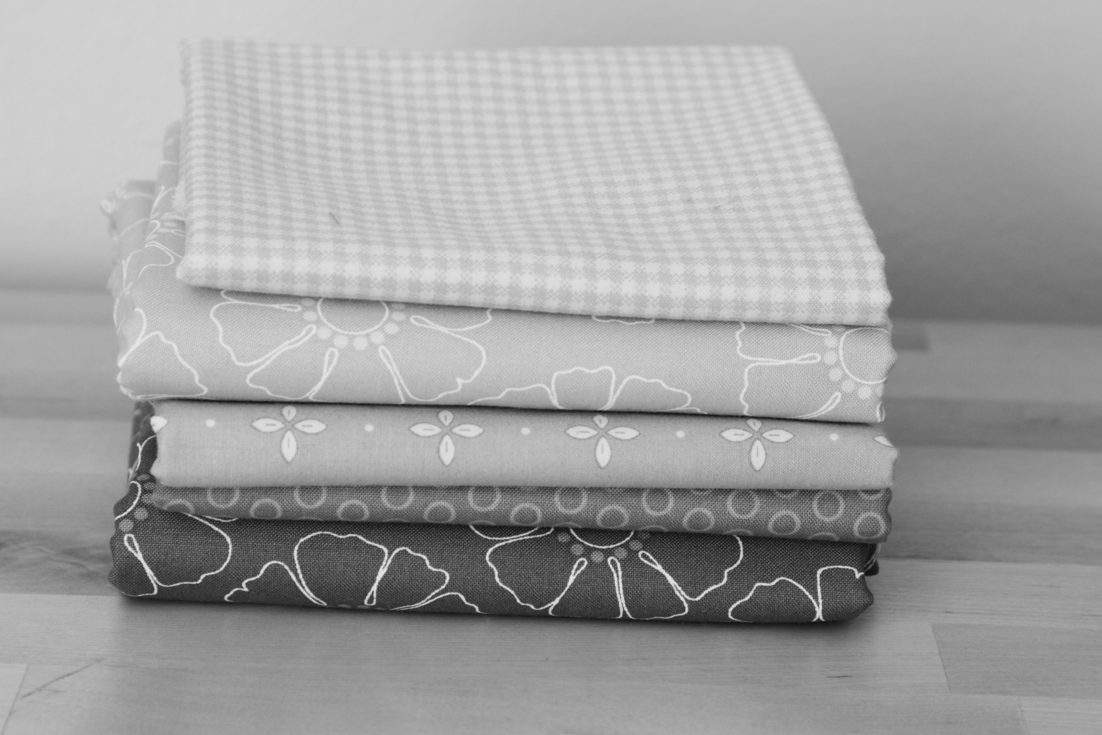
If you struggle with this concept, try taking a black and white photo of your fabrics. You'll be able to see which are lower in saturation. (I used a green filter on these pink fabrics which helped amplify the saturation differences--you may need to play around with it. Also, note the green filter was appropriate because the fabrics were pink--the complimentary color! :-))
- Undertones. This is related to the white balance I mentioned earlier. If you compare two different prints that are in the same color range, you'll probably notice that one looks "cleaner" than the other, or more "pure." That has to do with the undertones of the color. A primary color will appear more pure, while others will be a bit off-white. Think of red and rust. The rust pairs well with cream or off-white while the red works better with white. Fabrics with different undertones can certainly work together, but they will be higher contrast and you need to be aware of mixing them. You probably wouldn't pair pastel cantaloupe orange with rust orange, and it has to do with the undertones. They just wouldn't "look right." Often, if you feel like something doesn't look right, it's due to the undertones.

- Warm vs. cool colors. This is a little bit of color theory. All colors are categorized by being either warm or cool. If a color is blue, green, or purple, it is a cool color. If it's red, orange, or yellow, it's warm. More often than not, a quilt will contain both warm and cool colors, even if it's predominately one or the other. Using both helps provide both balance and contrast. There are exceptions, of course. However, if you feel like your bundle is missing something, try adding in a color from the opposite group. If you're mostly using warm colors, try adding in a pop of a cool color. If the contrast is too stark, try adding in a cool color that's on the warmer side, like a lime green, or a warm color that's a little cool, like magenta.

In the color wheel below, notice that the cool colors are all on the left side of the color wheel and the warm colors are on the right.

- Complimentary colors. This goes hand in hand with warm and cool colors, but is a bit more specific. If you look at a color wheel, the complimentary colors are those that are directly across from each other. So, red and green are complimentary, orange and blue are a pair, and yellow and purple. Of course, this goes beyond the most basic crayon box shades as well. yellow-green is a compliment of magenta. Blue-violet is a compliment of yellow-orange. This is a great starting place for finding colors that work together if you're stumped. Even if you don't use the direct compliment, this can help you see what might work well together. Also, if you'll notice, complimentary color pairs include all three primary colors: A primary color is always directly opposite a secondary color of the two other primary colors (i.e.: red is a compliment of green, which is made of blue and yellow). I think that must be why they work so well together: they are balanced because all the colors are there.

So--hopefully I haven't hurt your brain with this color theory. Stay tuned for next time, when I'll post about fabric selection and some important considerations there. In the meantime, challenge yourself to think hard about the colors you're including and why you like them together.
Excellent post, Becca!!!
ReplyDeleteI have a (weird?) question... if I were to use a single color or a single color family for a quilt, like your grey fabrics, for example. (I love those greys, by the way!!) If the undertones were mixed, would the overall effect turn out to be "muddy" like when you squint your eyes and look at it? Do you have to stick to clean vs pure undertones to make the quilt appear as a cohesive whole?
What a great question, Preeti! Thanks for asking it. I've emailed you, and will post a follow up post with more pictures soon. :-)
Delete