

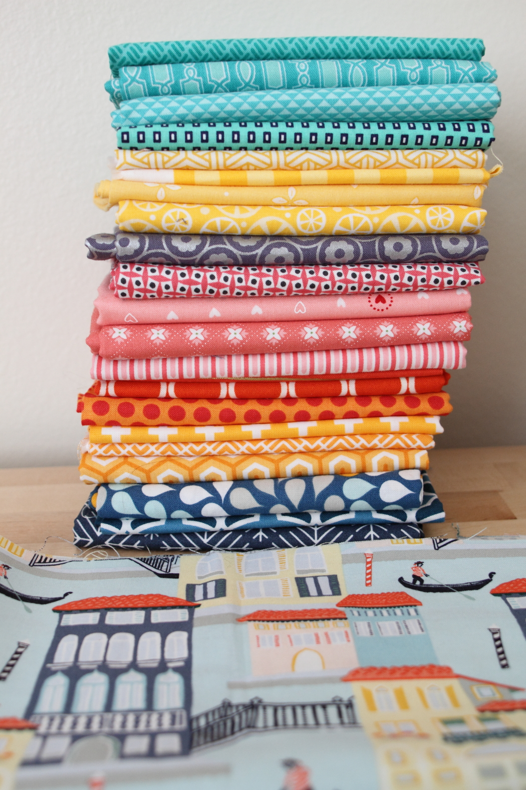
I've been acquiring cute travel prints for a while, and I couldn't resist the canal print from Kate Spain's Grand Canal line. But--I ordered it from Fabric.com with some other things, and so of course I ended up with a full yard due to their terrible pricing model on quilting cotton. I cut some off to make a notebook cover for my travel-loving sister, and decided that the scraps left from that cut would be perfect for a first block. But what prints to use with it?

I struggled at first with pulling coordinating prints for her notebook cover and ended up using solids. So when I decided to use the scraps for a block, I again had to consider coordinating prints. And I ended up with two separate stacks that both work equally well. I thought I'd showcase both of them here for Fabric Friday just to show how different two stacks that coordinate with the same focal print can be. Honestly, I can't even decide which one I like better, so I'll probably use both in the quilt.

I used a metallic print in both stacks and I think that complements the idea of Venice really well. Venice is so rich, and steeped with a history of wealth, that I think it works on a theoretical level. I did find that I had to be really careful with the blues and aquas because of how much of them there are in the background of the print. That was what I really struggled with when I was sewing the notebook cover. It needs good contrast so that the piecing is distinct.
So, as I was taking pictures of these stacks, I put them together, and realized that they make a really nice single stack, too! *sigh* I feel another quilt coming on!
No comments:
Post a Comment